
The Trouble With White
Everyone thinks white is the safe choice. It rarely is.
White is the colour everyone thinks they understand. It goes with everything, opens up a space, keeps things simple. And yet it is one of the most common reasons people contact me. The room felt safe on the colour chart, but at home it feels flat, cold, or somehow wrong. Done right, though, white is quietly remarkable. Calm, timeless, full of light, and far more joyful than people expect.
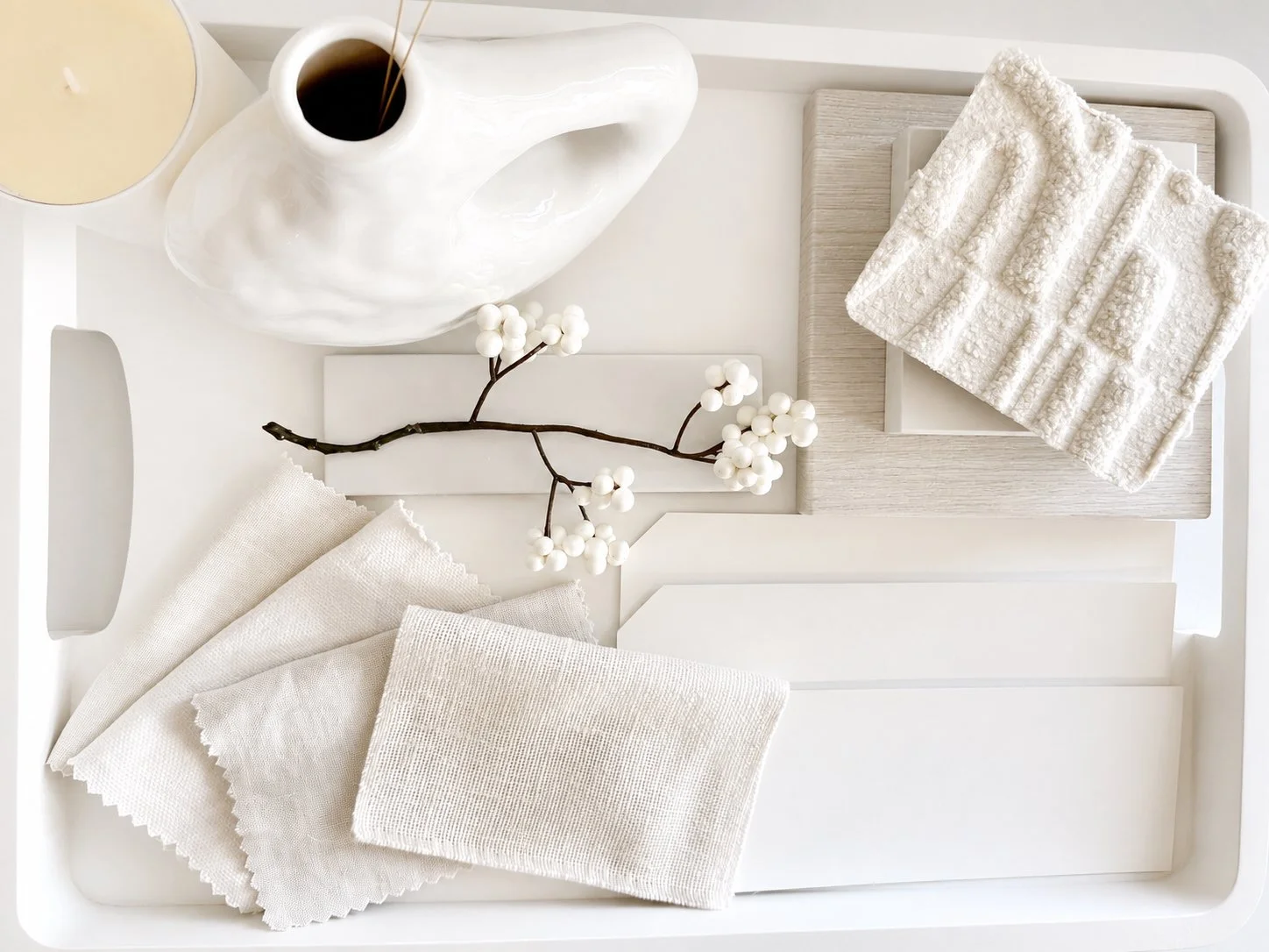
The quiet art of layering white on white.
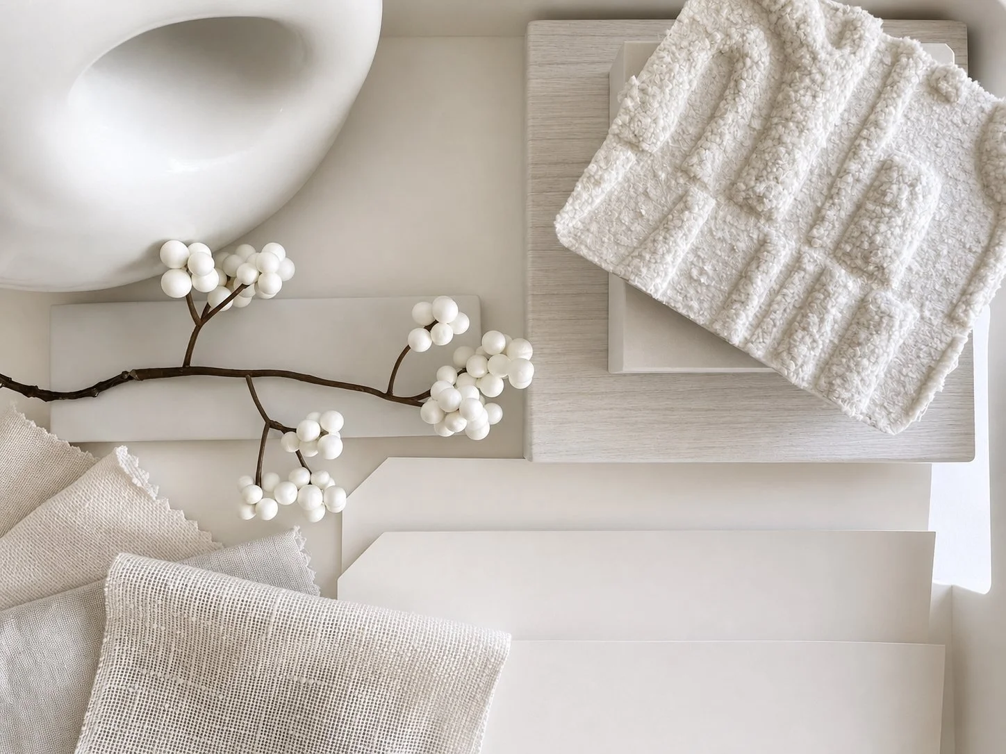
Why white is not the safe choice
Most people choose white because it feels like a non-decision. It is the colour you reach for when you do not want to get it wrong. But white is not a safe option.
It is one of the hardest colours to get right, because every mistake shows. There is nowhere to hide in a white room. If the tone is off, the light is working against it, or the surfaces around it have nothing to say, the whole room feels empty rather than calm.
The problem is rarely the white itself. It is usually the wrong white, or a white with nothing around it to bring it to life.
Start with the undertone
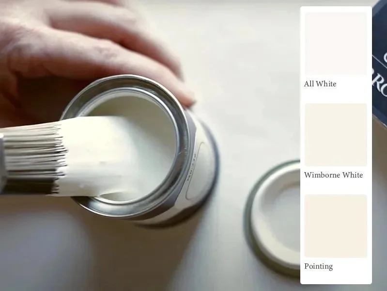
Every white has an undertone. It is the first thing to get right and the thing most people never check. A white can lean blue, grey, green, yellow or pink, and that lean decides how the whole room feels. Blue-based whites read sharp and cool. Yellow or pink-based whites feel softer and warmer.
The trouble is you cannot see it on a small chart under shop lighting. The undertone only shows itself on a full wall, in your own light, next to another white. Hold two whites side by side and the cooler one gives the warmer one away at once. That single comparison tells you more than any name on a tin.
Choose the undertone for the room you have, not the white that looked right in someone else's.
Image: Farrow & Ball.
Let the light decide
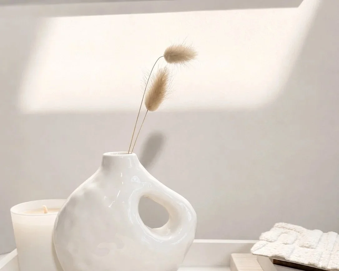
White has nowhere to hide, which means light matters here more than with any other colour. The same white shifts from one room to the next, and from morning to night.
A north-facing room stays cool, and it will pull the life out of a brilliant white, leaving it flat and stark. A south-facing room is warmer and far more forgiving. East and west rooms change through the day. None of this means one white is better than another. It means the white has to suit the light it will actually live in.
If a white looked crisp in the showroom and cold at home, the white did not change. The light did.
Layer texture so white never reads as bare
A white room needs texture the way a coloured room needs contrast. Without it, white reads as empty rather than calm. With it, white becomes soft, warm and full of depth.
Think in materials, not just shades. Linen, boucle, marble, stone, plaster, pale timber, all of them are white or close to it, yet each one catches the light differently and carries its own undertone. Layered together, they give a white room something to say.
This is where a white scheme comes alive. The colour is only half of it. The textures around it do the rest.
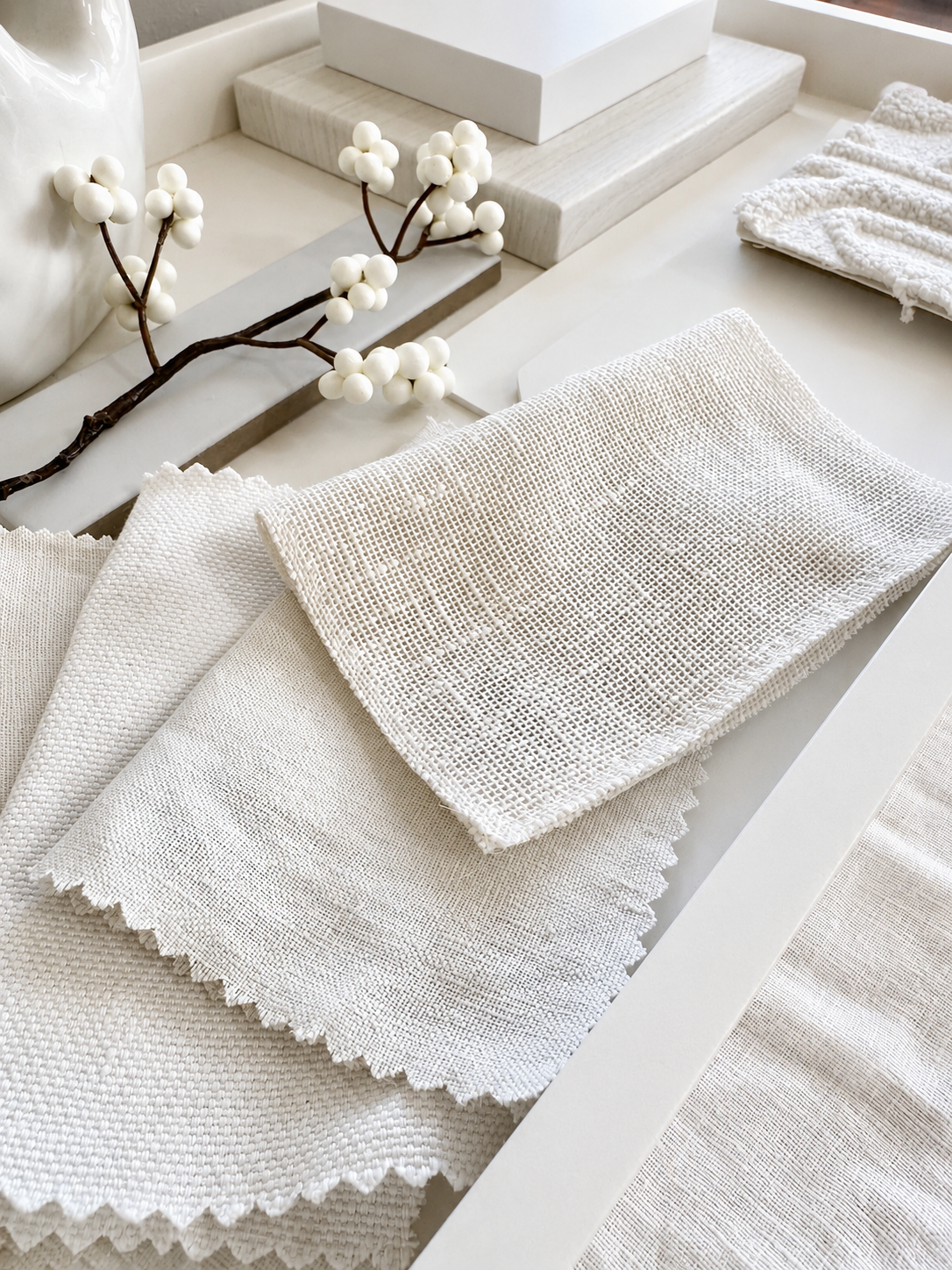
Linen, boucle and white paint, soft shades layered together.
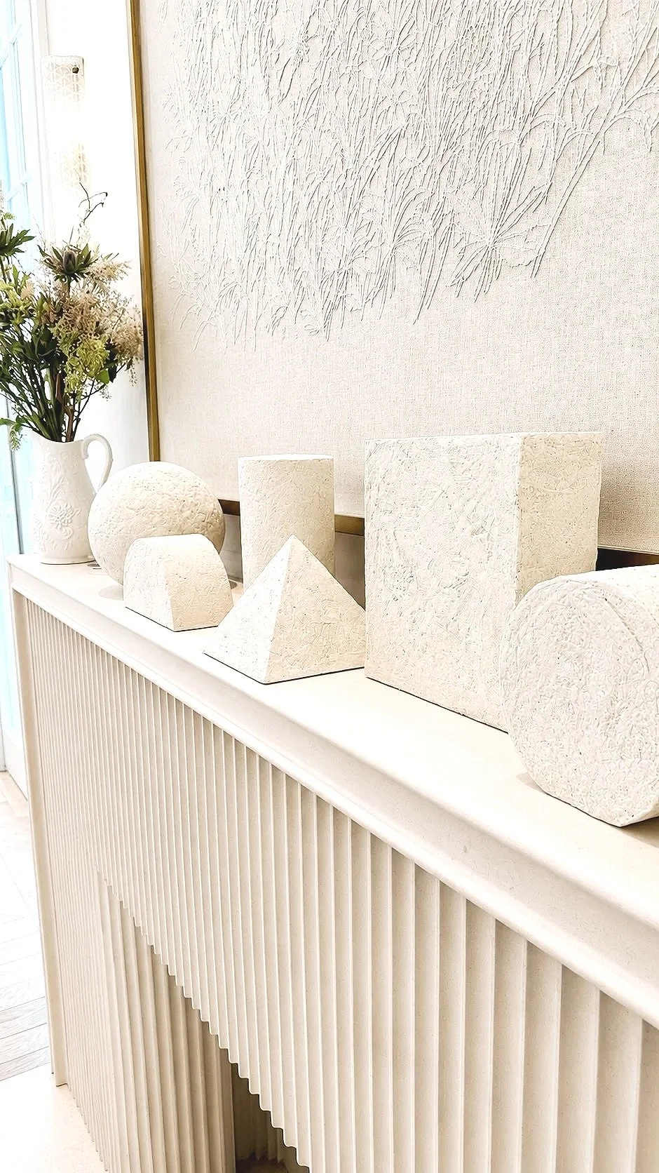
Inspired by Phillip Jeffries at WOW! House, texture turns white into a beautiful layered focal point.
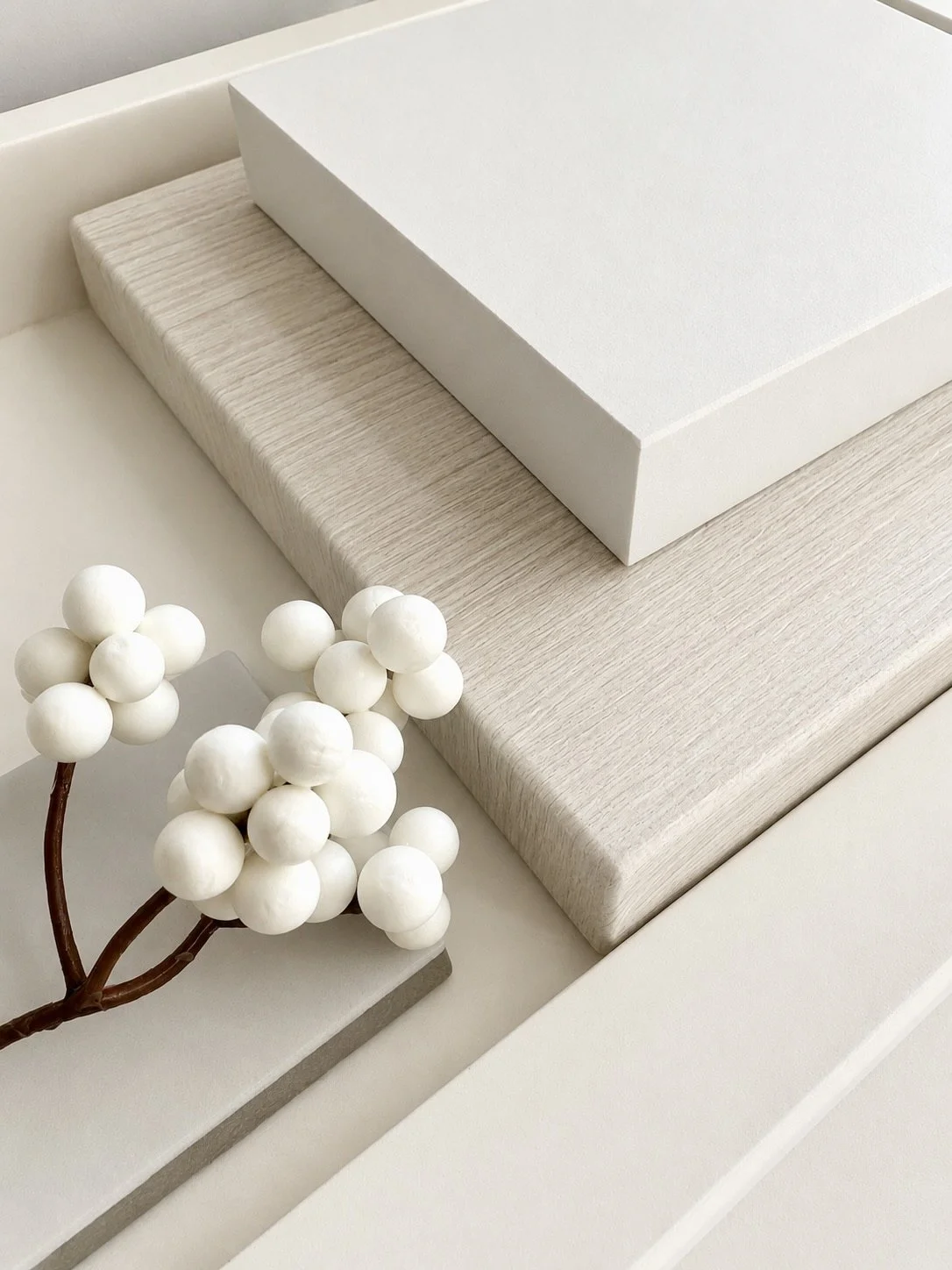
Glossy marble against white wood wash, two textures, one shade of white.
Stuck on a space that isn't working?
Getting white right is rarely about one perfect shade. It is about reading the room, the light it lives in, and the surfaces already in it, then choosing in the right order.
That reading is the colour consultancy at the core of a Design Session. One hour, online or at home, to get clarity on the colours you are choosing and the confidence to move forward with them.
If a room has stopped feeling right, a Design Session is a one-hour session to work out why. Working across Leicestershire, Rutland and the surrounding counties, and online UK-wide. BIID Registered.
Photography by Debbie Greasley of CoCo Interiors, except where credited.